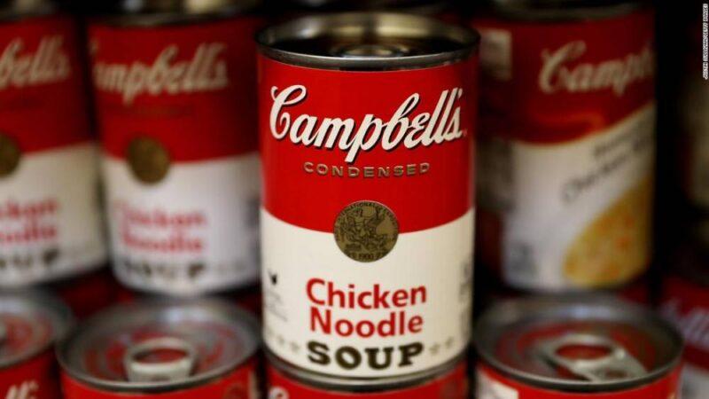
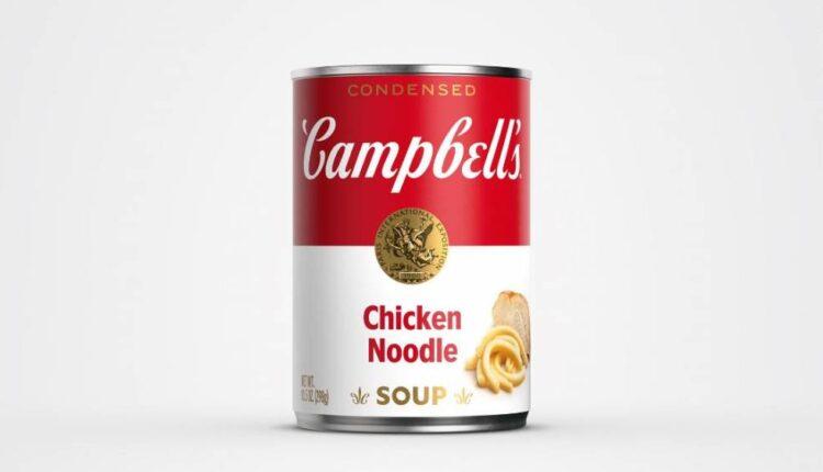
New York (CNN Business)The labels on Campbell’s soup cans are getting their first redesign in about 50 years.
Eagled-eyed customers will notice that the famed red and white design remains, but the Campbell’s logo is receiving a “modernized logo scripture,” which includes eliminating the shadow and a slightly changed font that is based on founder Joseph Campbell’s original signature. Other changes include the word “soup” printed in a new font, along with a slanted “O” as a nod to the brand’s original label from 1898. Also, the “C” from the redesigned Campbell’s signature is used in the fleur de lis next to the word soup. Varieties receiving the redesigned labels include tomato, cream of chicken, cream of mushroom and chicken noodle. The redesigned cans are currently rolling out to store shelves.

The redesigned Campbell’s soup can.The changes “still evokes the same sense of comfort, goodness and Americana” as its predecessor, Campbell Soup Company (CPB) said in a statement. The soup maker said it’s hoping to “reimagine” the brand for a new generation of customers that are increasingly cooking at home because of the pandemic.

The old label.To celebrate the launch, Campbell’s is selling its first-ever non-fungible token (NFT) of the new label beginning Tuesday at 5:30 pm ET with proceeds benefiting Feeding America. The brand tapped street-style artist and illustrator Sophia Chang to create an NFT that is a “tribute to Campbell’s continued evolution shown through the iconic designs it has produced throughout the years.”Read MoreSales of Campbell’s soups exploded last year as people sheltered in place because of the pandemic. However, this year hasn’t been as profitable because of rising supply chain costs and inflation. The company announced in June it’s increasing the prices it charges retailers and other customers by an average of roughly 5% later this year.
Source: edition.cnn.com

