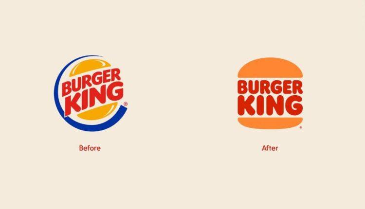
New York (CNN Business)Burger King’s identity is getting a whopper of a refresh, with its first new logo in more than 20 years.
Using colors inspired by its “real and delicious food,” the fast food chain unveiled Thursday a retro-influenced new identity that includes a redesigned (yet recognizable) logo and new food packaging, employee uniforms and signage in its soon-to-be remodeled restaurants.
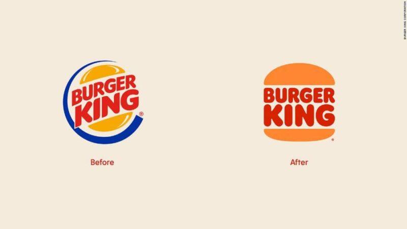
Burger King’s old and new logo.The centerpiece of the redesign is the logo, ditching the blue curve that’s been in use since 1999. Burger King said in a press release that the new “minimalist logo seamlessly meets the brand evolution of the times.” It also pays tribute to brand’s 64-year-old history, with the refreshed look emulating an old logo used from 1969 to 1999.
Customers will notice colors that are “rich and bold” on its signage with a new, custom-made font called “Flame.” The chain said the font is inspired by the shapes of its food because it’s “rounded, bold and yummy.”
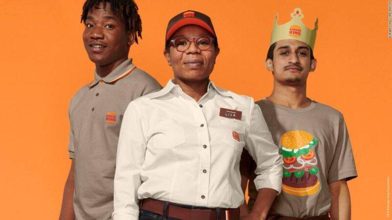
New crew uniforms.The look will extend to its employees, who will wear clothing that mixes “contemporary and comfortable style with distinctive colors and graphics.” Actual employees are featured in its new ads and promotional pictures. Read MoreIts redesigned packaging highlights the new logo, includes “playful illustrations of ingredients” and adjectives that describe the food, like “crispy” and “tasty.” Notably, Burger King’s packaging comes a few months after McDonald’s also revealed new wrappers and cups.
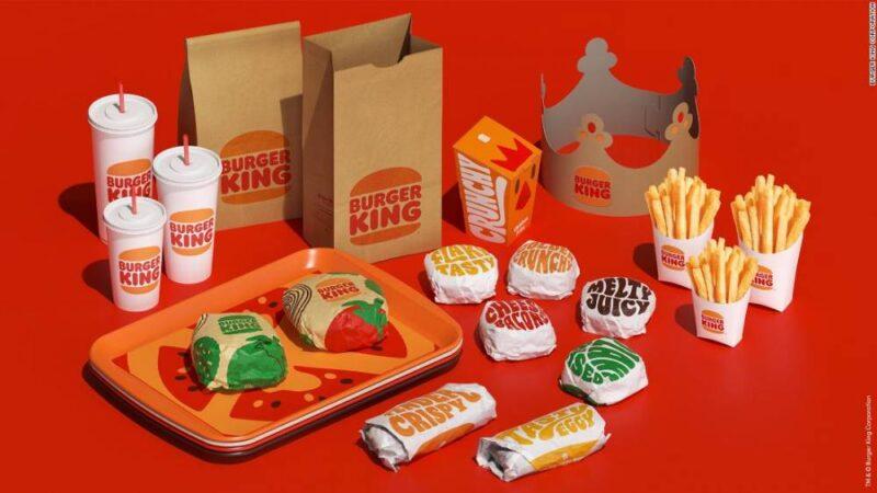
The new packaging.In September, Burger King introduced new restaurant designs fit for the coronavirus era with triple drive-thrus, burger pickup lockers and takeout counters. The designs will be tweaked to highlight the revamped visual identity. Customers will begin seeing some of the new identity immediately in advertisements, signage and packaging. However, the renovation of its nearly 19,000 global restaurants to reflect the new look will take several years.
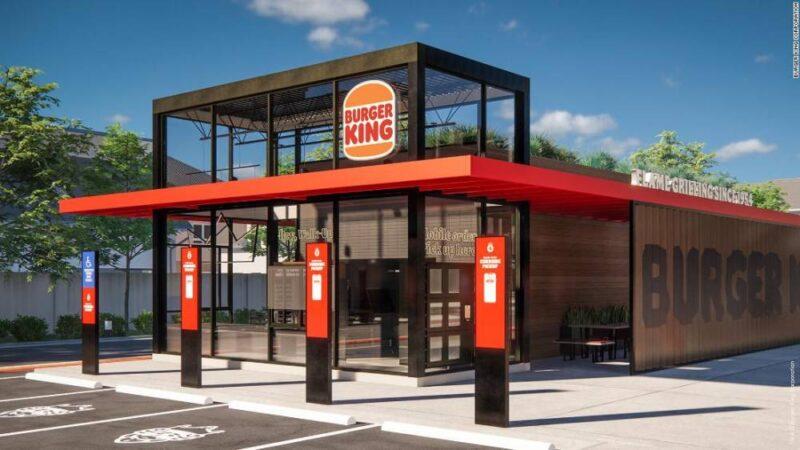
The exterior of a redesigned restaurant. (Rendering)”Given the current state of the world, the new identity feels warm and familiar,” Douglas Sellers, executive creative director at global branding firm Siegel+Gale, which wasn’t involved in Burger King’s redesign, told CNN Business. He added that redesigned logo is “instantly recognizable anywhere in the world” and that the colors “evokes joy and warmth harkening back to their heritage.”
Perhaps the fresh design and familiarity could reignite diners’ interest in Burger King. Owner Restaurant Brands International (QSR) said the burger chain has been struggling during the pandemic. In the three months that ended on September 30, sales at its restaurants open at least a year fell 7%. Meanwhile, sales at rivals McDonald’s (MCD) and Wendy’s (WEN) outpaced Burger King during the same quarter. Another part of Burger King’s turnaround plan includes adding more value items, which it did last month with the launch of a new $1 menu.
Source: edition.cnn.com

